What's new
Work in progressAdditions and improvements, newest first.
New themes
The next themes are defined and arriving shortly.
- Pitchside
Sport - All in, every minute - Lumon
Corporate - Optics and Design - Scoop
Gelato - A scoop of happiness - PhysioHub
Education - A clearer way to learn
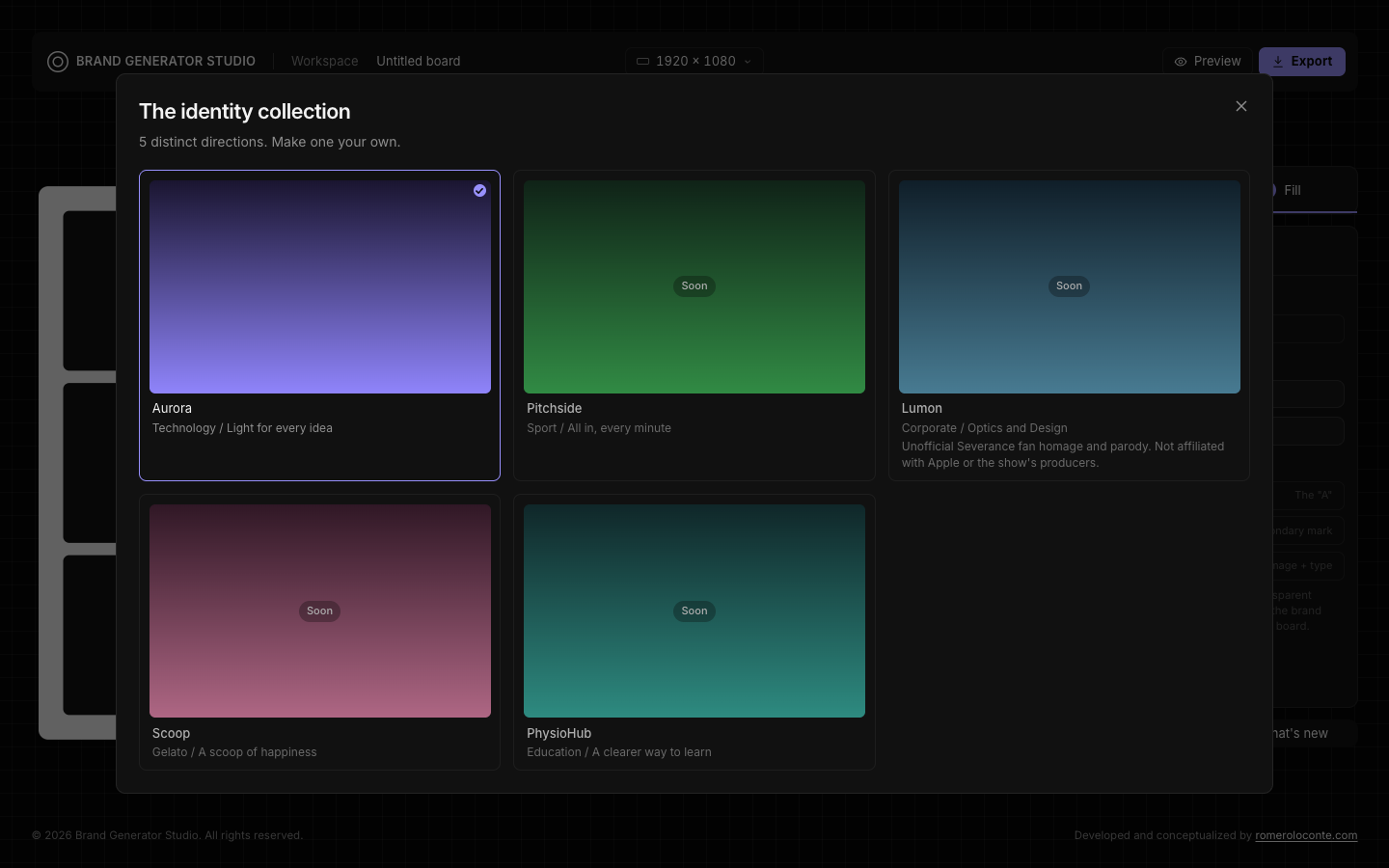
Theme-agnostic Default
Design Brand Studio now starts from a neutral Default theme. It shows the studio is fully customizable and isn't tied to any one theme: pick the identity that fits your brand, or start from a blank slate.
Refined theme picker
The theme selector was adjusted so switching between Default and the other themes is clearer and easier.
Interface improvements
Smaller refinements across the editor for a cleaner, more consistent experience.
Color palettes for Aurora
Aurora now comes in eight palettes: Original, Forest, Sage, Cobalt, Volt, Ember, Dune and Coast. Switch palettes and the whole board recolors instantly.
Type pairing
Choose your brand typeface from eight Google Fonts, from clean sans like Inter and Space Grotesk to display serifs like Fraunces and Playfair. Every block on the board follows your choice.
New grids
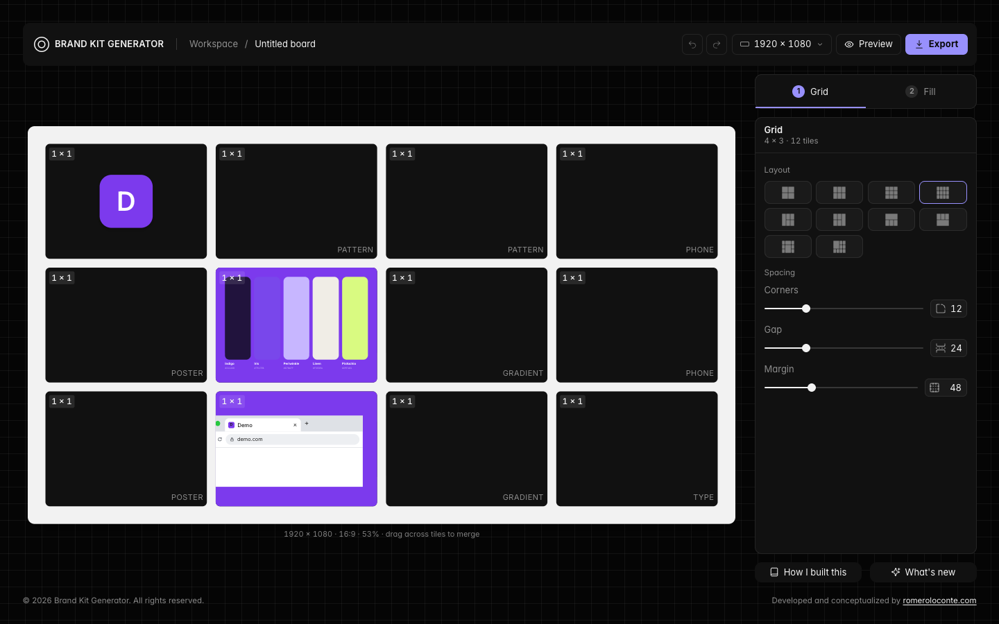
Sixteen layout presets to start your board: uniform grids from 2 × 2 to 5 × 3, plus compositions like Split, Hero, Collage, Mosaic, Posters and Bento.
Bring your own logo
Upload your own logo, generate your own brand ID kit, and customize everything you need.
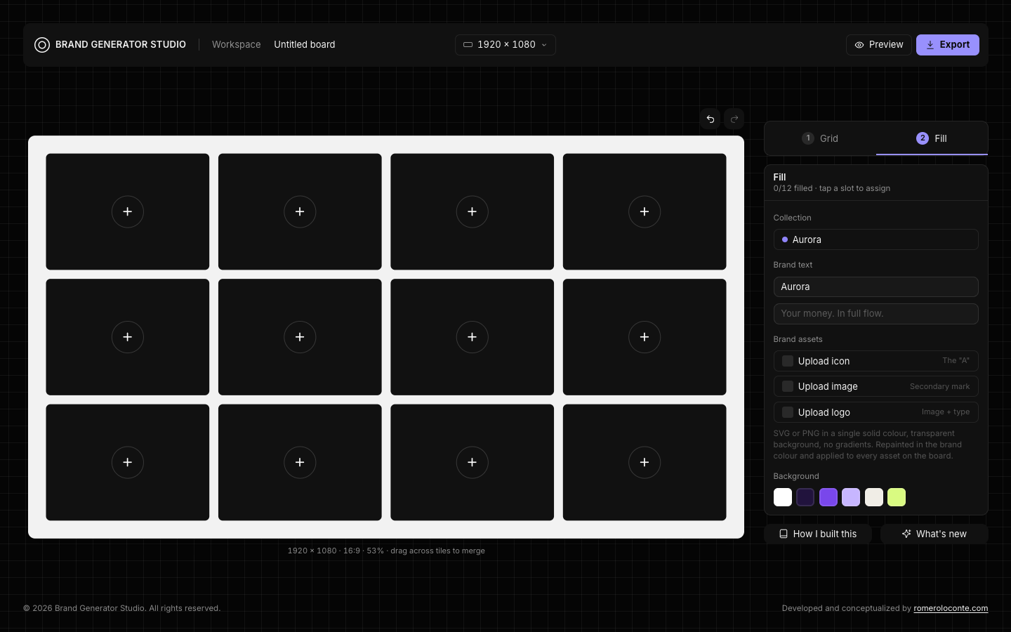
Smarter Auto fill
We improved the Auto fill algorithm so the same content no longer repeats across the blocks of your board.
Editable mockup text
New fields let you edit the texts that appear in the mockups.
Aurora theme for Finance
Finished, with an Electric & Fluid palette.
Improved interface
A cleaner, more comfortable experience.
Canvas background colors
Pick a background color for the whole canvas.
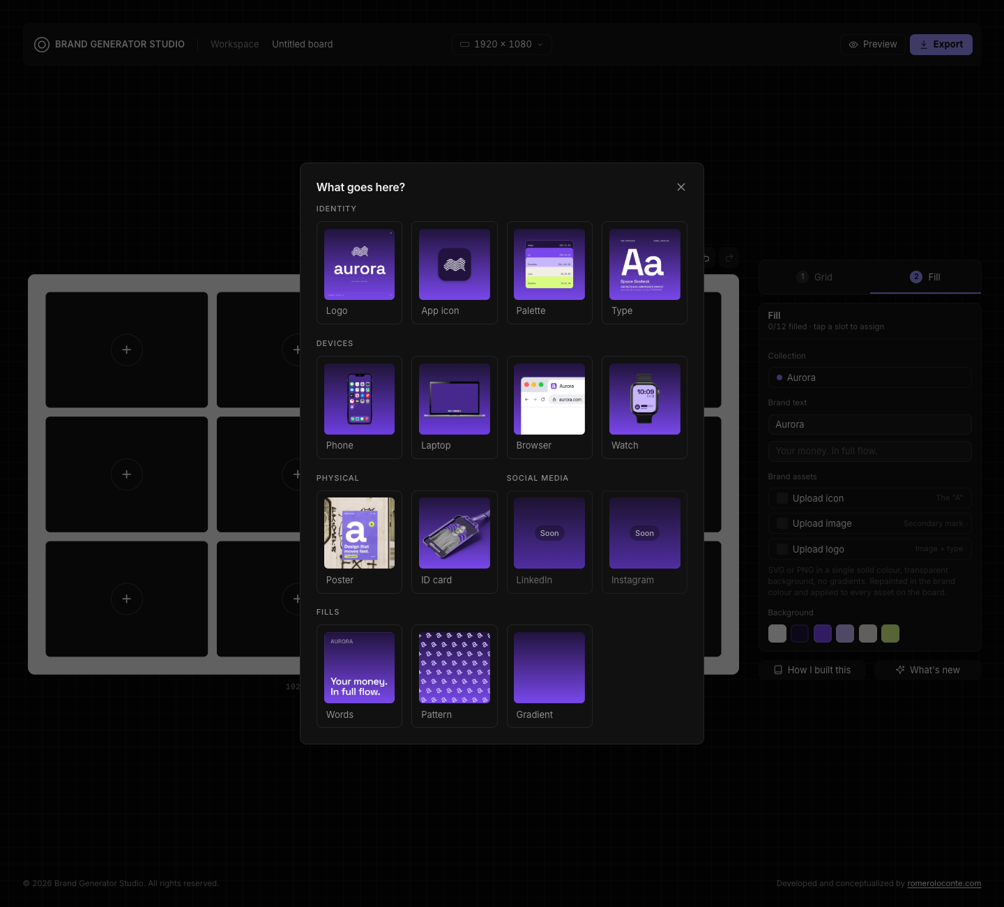
Content menu grouped by category
The "What goes here?" menu is now organized by category, so you can find what you want faster.
- Identity
- Devices
- Physical
- Social media (soon)
- Fills
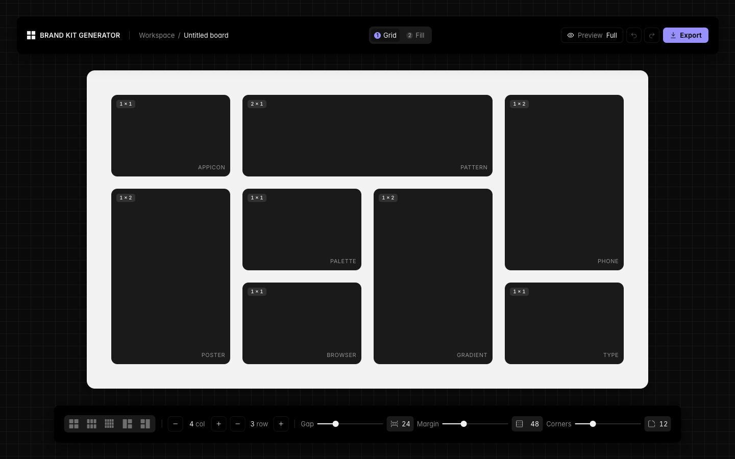
Shaping the UI
The editor is getting its final look: the bottom toolbar moved into a floating side panel on the right, a slim header with an editable board name, and quiet secondary links below. Same dark surface, one accent, hairline borders everywhere.
How I built this & What's new
Two small pages that tell the story of the project, starting with this one.
Export your kit
Render the whole board to an image in one step. Editor chrome hides itself during capture so only the kit remains.
Asset picker
A "What goes here?" panel lets you choose what each block holds: logo, palette, browser mockup or app icon.
Board modules
The empty grid cells became real modules. Each one renders its own content (logo, palette, browser, app icon) and can be merged with its neighbours by dragging.
A change of direction
The first prototype was a gradient board. We kept its foundations (tokens, grid, undo history) and pivoted the product into a brand kit generator. Tailwind moved to v4 along the way.
The wireframe
Where everything started: a board on a 24px grid, a fixed side panel and a footer. No content yet, just the structure that every later module would sit in.